Friday 15 June 2012

Bereton Posters


Here are two of my Bereton Poster designs that were chosen to be put up in the bereton restaurant in the college. I designed for mine, a cork screw and knife, fork and plate created out of words.

Xbox 360 Poster

Here I have done a Xbox 360 poster inspired by Shepard Fairey. For this poster, I decided to do my hand holding the controller so that it looked like a fist. I got this idea when flicking through propaganda books that had old World War 1 and 2 posters inside, and from that I saw the fist that were used mostly by Russians that represented power, strength and respect. I then used Shepard Fairey's style of his Obama Hope poster and used that to create my hand, background and text. I decided for colours to use colours used with Xbox so that it went with what I was creating, and the colours I chose were green and red in different shades. I also decided to use the strapline which is used in Xbox, that is 'Jump In'.

Thursday 14 June 2012

Olympic Stamp Design

 Here I have done a stamp for the Olympics and Royal Mail. I designed this stamp to match the 2 other stamp that I created previously which were the paralympic and tennis stamps. I decided to create this new one of hurdles as the one I created previously of hurdles didn't match the first two, so I took the idea of hurdles and created my stamp of a close up of a athlete jumping over a hurdle.

Monday 21 May 2012

Xbox 360 Surface Graphics Design Ideas

Here I have designed a surface graphic for my Xbox 360 Packaging in the style of Shepard Fairey. For this, I first found an image of the sea and then opened it up large to A3 on Photoshop. I then used a wacom tablet to draw the waves, rocks and clouds using the paint tool. Once I done that, I saved it and then opened the drawing on Illustrator, then I highlighted it and went to Object - Live Trace - make to get the document to be an individual line. Then I highlighted it again and went to Object - Live Paint - Make so it would be possible for me to add colour into different parts quickly and neatly. I then used the Live Paint Bucket and chose a colour and then started adding colour into the sections I wanted too colour. I then placed in my hand holding an Xbox Controller which was inspired by Shepard Fairey's Hope poster and moved and resized until it was in the right position.

FMP Posters

FMP Final Outcome

 Here I have created my Final Net Design for Xbox 360, where I have chosen to do it in Shepard Fairey's style. For this, I first had to open up the existing xbox 360 packaging to see the net. I then did a rough drawing of the net and then used a ruler to measure the every line so I can create the net later. I then opened up InDesign and drew my net using the rectangle shape tool to draw each square/rectangle separately. I then looked into Shepard Fairey to see his patterns he has created, from that I designed a pattern using my logo, xbox controller and console silhouette. Once I done that, I scanned in the design for a rough template so I can neatly do it on Illustrator. I drew the pattern with the pen tool and then moved the shapes together to get them neat and precise. Once i done that, I placed the pattern onto the InDesign document with the net, and then made a layer underneath the nets layer. I then tiled the net until it filled the whole net and then I placed my Shepard Fairey hand with controller and placed it on one part of the net that I needed it. I then copied it and rotated it and placed on the opposite side of the other. Once I added them, I added my information and images that is found on the xbox 360 box and then drew 4 rectangles on 4 parts and changed the text to white.

Friday 10 February 2012

Final Narrative Illustrations

Here I have done 3 Final Narrative Illustrations for James and the Giant Peach. For this, I was inspired by Jan Pienkowski who's style is using Silhouette's to create his work. For my first narrative piece, I chose to use the quote from the book about when the parents of James died by being killed by a rhino. I chose to use a dark red background as it's a symbol of anger, there is death of the main characters parents. The second Narrative piece, I chose to use the quote from the book where James and his Aunties were looking up at the dead tree with the peach growing off of it. I used the oval tool to create a circle then a circle inside and then I filled them with white and then used the feather tool to make it look like the moon behind clouds. I then chose to use a dark green background as it is night time and it was a neutral colour because of it being night time and their happiness as there is finally something growing. For my third final Narrative piece, I chose to use the part of the book where Miss Spider was creating a hammock like bed for James to sleep in made from thread. I chose to use a orange/peachy colour for the background as its the inside of the peach. I also chose to use the pen tool to draw the sides of the peach and then filled it with black as it is at the front of the image.

Friday 3 February 2012

Packaging


Here I have done some packaging designs for Fruit Juice. I did the first image by first working out what length, width and height I needed it to be. I then found a picture of an orange and placed it inside the net covering three sides, I then got ingredients of the internet for orange flavour orange juice. For the Fruit Juice label, I first needed a bottle to put it round to get the measurements, so I went down to Waitrose and bought a bottle I thought would work best for my label. I then made the rectangle box for the product and then got an image of an orange and drew round it with the pen tool and then used the eye dropper tool to get the right colour for the different sections. I then got information about the product e.g. ingredients and Nutritional information and placed on the sides of the label, I then made a glue tab so I knew where to stick it down.

Typography

 Here I have done some typography designs using Illustrator. I did this by first chosing a word "think" and moving the letters individually by rotating, resizing or moving them about. I chose to use the book hand job and i designed it so the letters look like it is going diagonally across the page.

Monoprint

Here I have done a monoprint of myself using graphite and a picture of myself. I did this by first using a picture of myself, I used a graphite pencil to cover the back of the picture. I then used masking tape to hold my picture down on to another paper and then using different objects such as pens and pencils, I created my face. Then once i done that, I used the spray mount to cover ripped paper, and then i stuck them on top as a border.

Character Creation


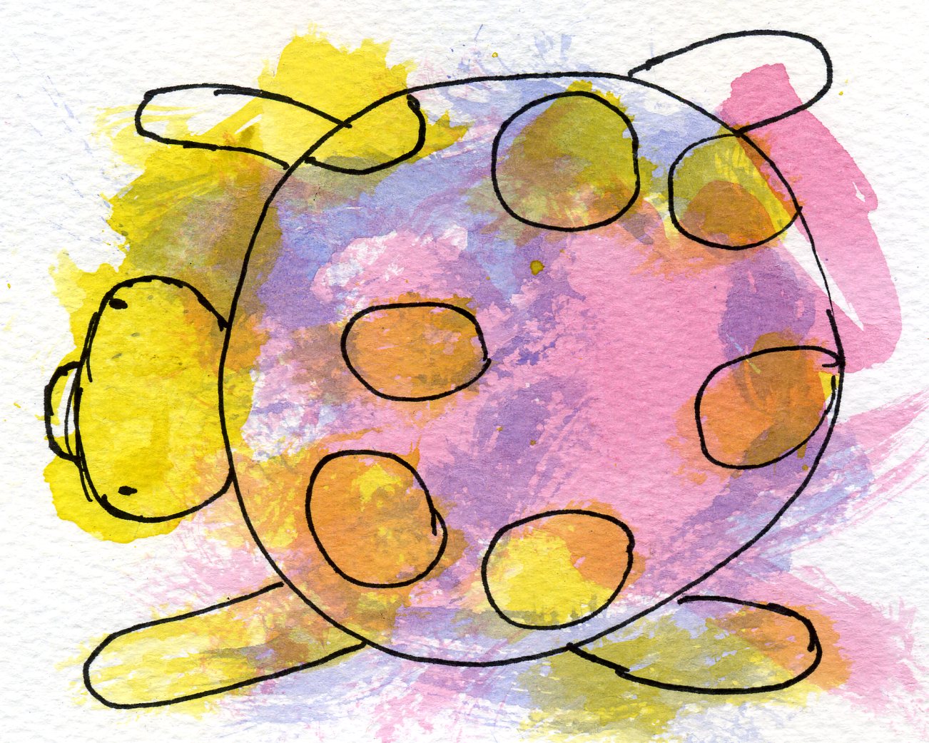
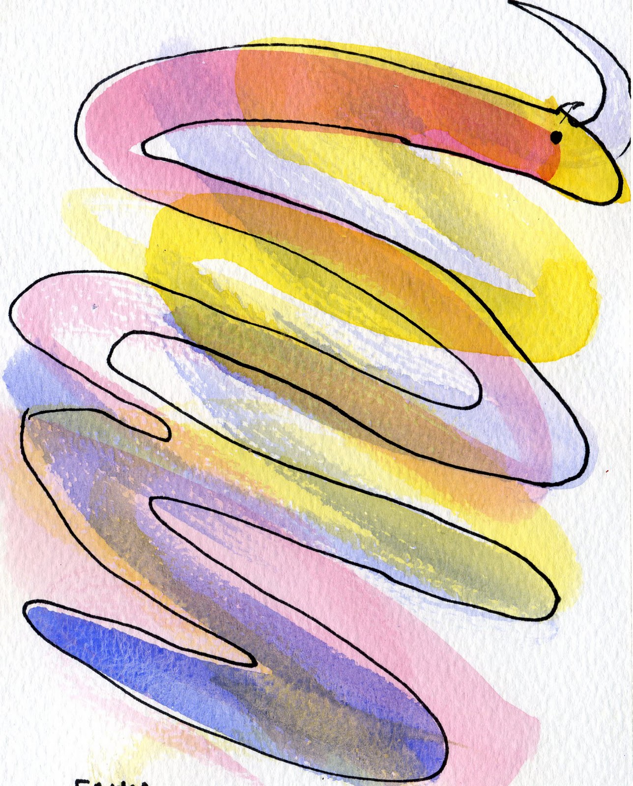
Here i have done some Character Creation out of random paint brushing. For this, I was first told to use watercolour to do random patterns on the paper using first red, then blue and then yellow. I then had to do random patterns using acrylic but only using red on one page, blue on another, then yellow on the last, but for these we had to use different shaped spatulas to create our patterns. I then a week later got told that we did this to see if we could create a character/objects out of the paint marks we saw. For mine, I saw a masked man, snake, duck, tortoise, stone giant and an elephant.

Thao Lam Illustration

Here I have done a Thao Lam inspired Narrative for my chosen book "James and the Giant Peach". For this, I first drew my characters and images on an A3 sheet and then scanned them in and opened them up on illustrater. I then used the pen tool to go round the different parts of the characters/images so i can place a texture from the internet inside the different parts. I then went on google to find textures in orange, green, grey, black and white and then saved them and then placed the textures on the side of the illustrator page. I then one by one placed the textures in the chosen parts and grouped and placed the characters/images in place.

Wim Crouwel Poster

Here I have done a Wim Crouwel poster inspired by Wim Crouwel. For this, I first used a image I took of the "C" Wim crouwel created in the Design museum in London and then I used the shape tool to draw rectangles going vertically and horizontally across the page. I then went on dafont.com to get Wim Crouwel font and wrote his name going vertically on the left side. I then used the same font to write a paragragh about Wim Crouwel.

ALT Magazine


Here I have got images of my magazine project posters, where I created a front cover and double spread. For this I did the style of David Carson which is very grungy and hard to read. For this, I had to take pictures of myself in Criminal Damage and Drop Dead clothing as I was doing a magazine for Alternative clothing. I chose the name "ALT" as it is an abreviation of Alternative. I also done some A3 pages of messy background using masking tape, black ink and a paint brush to write the word ALT in maasking tape and use the ink and brush to go over it. I then scanned it in and placed it as my background and used the opacity tool to make it more transparent.

Monday 23 January 2012

Equality and Diversity

Here I have done a Equality and Diversity poster for Canterbury college where I have based my design on words people say to affend or discriminate gay people. I chose to write the words in different fonts I like and put them inside a speech bubble to look like it is being said. I then wrote a caption at the bottom "Words fail us, Think before you speak" in capital letters.

Friday 20 January 2012

Olympic Stamp Designs


Here I have done two Olympic stamps for the 2012 Olympics and the Royal Mail. For my stamps, I decided to do an Paralympic and a Tennis Stamp and used Illustrator to create my stamps to reflect the Olympics.

Self Portrait

 Here i have done some posters of myself inspired by to artists, Shepard Fairey and Julian Opie.